Shaw Theatres App
Shaw Theatres App
Shaw Theatres
Here is the case study of a redesign I did for a local theatre's mobile experience as part of a 10-week design immersive course at General Assembly.
Here is the case study of a redesign I did for a local theatre's mobile experience as part of a 10-week design immersive course at General Assembly.
Here is the case study of a redesign I did for a local theatre's mobile experience as part of a 10-week design immersive course at General Assembly.
Here is the case study of a redesign I did for a local theatre's mobile experience as part of a 10-week design immersive course at General Assembly.
Here is the case study of a redesign I did for a local theatre's mobile experience as part of a 10-week design immersive course at General Assembly.
Research
I. Business objectives
Having a good ticket booking experience is imperative for sales. If users aren't able to get tickets easily on Shaw's app, it is very possible they would use an aggregator app instead, or worse still, drop off completely. Using an aggregator app opens up options for the users to patronise a different theatre for the same movie.
Keeping users on Shaw's exclusive app reduces competition with other cinemas and has a better chance of retaining customers for future transactions.
Keeping users on Shaw's exclusive app reduces competition with other cinemas and has a better chance of retaining customers for future transactions.
Keeping users on Shaw's exclusive app reduces competition with other cinemas and has a better chance of retaining customers for future transactions.
II. Competitor analysis
One of the good news we found (not so much for users) was that other local cinemas had similar unpolished user experience on their mobile apps as well. There isn't a strong emphasis in the industry on booking tickets through mobile phones–they are mostly done on websites or at physical booking kiosks. If done well, this would place our app in a strong position on the market.
III. User interviews and guerilla testing
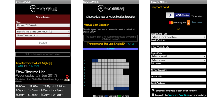
To better prove some of our initial evaluations and assumptions, we set out to the nearest Shaw Theatre to speak to a few patrons and had some of them test out the app in real-time.
The participants were recruited within the vicinity of the Shaw Lido movie theater. This is based on the assumption that they are customers of Shaw and that they were within the area to watch a movie soon. We gave these participants different tasks to perform on the app. The primary task required participants to book a specific movie from the app. This same task would later be tested on our proposed prototype as well. Putting them in the shoes of the user wasn't hard since most of them were actually there to watch a movie.
The test took into account both quantitative and qualitative methodologies. For quantitative results, we used three metrics:
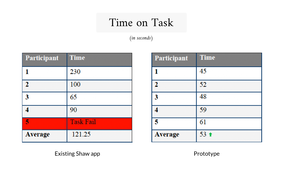
A. Time on task: total time taken for each task
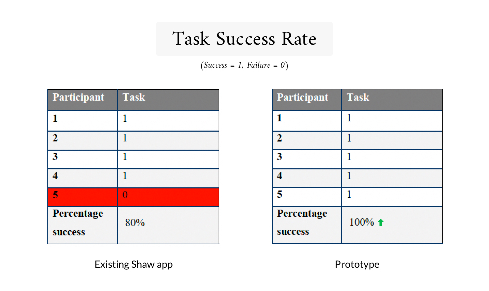
B. Task success rate: binary data on whether user successfully completes or fails the tasks
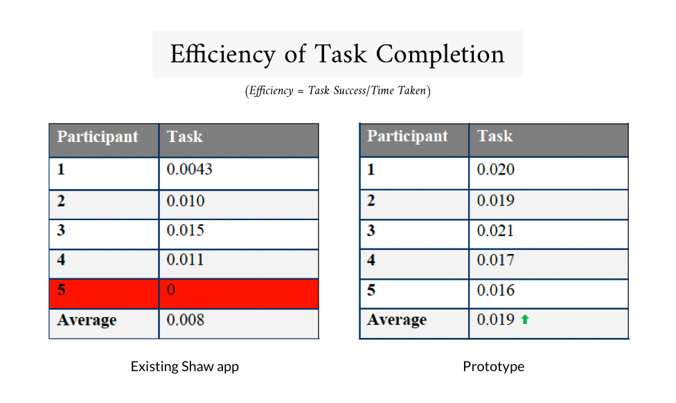
C. Efficiency of task completion: task success over time taken for each given task (b/a = c)
For qualitative methodologies, the test took into account the paths taken by the user, types of errors participants made, the verbal and non-verbal cues participants expressed as well as feedback given by the user after the tests are conducted. These gave us a good idea of users' expectations and surface-level pain points.
The full usability test report with the tasks we set, detailed test outcomes, and recommendations can be accessed here.
III. User interviews and guerilla testing
To better prove some of our initial evaluations and assumptions, we set out to the nearest Shaw Theatre to speak to a few patrons and had some of them test out the app in real-time.
The participants were recruited within the vicinity of the Shaw Lido movie theater. This is based on the assumption that they are customers of Shaw and that they were within the area to watch a movie soon. We gave these participants different tasks to perform on the app. The primary task required participants to book a specific movie from the app. This same task would later be tested on our proposed prototype as well. Putting them in the shoes of the user wasn't hard since most of them were actually there to watch a movie.
The test took into account both quantitative and qualitative methodologies. For quantitative results, we used three metrics:
A. Time on task: total time taken for each task
B. Task success rate: binary data on whether user successfully completes or fails the tasks
C. Efficiency of task completion: task success over time taken for each given task (b/a = c)
For qualitative methodologies, the test took into account the paths taken by the user, types of errors participants made, the verbal and non-verbal cues participants expressed as well as feedback given by the user after the tests are conducted. These gave us a good idea of users' expectations and surface-level pain points. This information will be relevant again below.
The full usability test report with the tasks we set, detailed test outcomes, and recommendations can be accessed here.
III. User interviews and guerilla testing
To better prove some of our initial evaluations and assumptions, we set out to the nearest Shaw Theatre to speak to a few patrons and had some of them test out the app in real-time.
The participants were recruited within the vicinity of the Shaw Lido movie theater. This is based on the assumption that they are customers of Shaw and that they were within the area to watch a movie soon. We gave these participants different tasks to perform on the app. The primary task required participants to book a specific movie from the app. This same task would later be tested on our proposed prototype as well. Putting them in the shoes of the user wasn't hard since most of them were actually there to watch a movie.
The test took into account both quantitative and qualitative methodologies. For quantitative results, we used three metrics:
A. Time on task: total time taken for each task
B. Task success rate: binary data on whether user successfully completes or fails the tasks
C. Efficiency of task completion: task success over time taken for each given task (b/a = c)
For qualitative methodologies, the test took into account the paths taken by the user, types of errors participants made, the verbal and non-verbal cues participants expressed as well as feedback given by the user after the tests are conducted. These gave us a good idea of users' expectations and surface-level pain points.
The full usability test report with the tasks we set, detailed test outcomes, and recommendations can be accessed here.
III. User interviews and guerilla testing
To better prove some of our initial evaluations and assumptions, we set out to the nearest Shaw Theatre to speak to a few patrons and had some of them test out the app in real-time.
The participants were recruited within the vicinity of the Shaw Lido movie theater. This is based on the assumption that they are customers of Shaw and that they were within the area to watch a movie soon. We gave these participants different tasks to perform on the app. The primary task required participants to book a specific movie from the app. This same task would later be tested on our proposed prototype as well. Putting them in the shoes of the user wasn't hard since most of them were actually there to watch a movie.
The test took into account both quantitative and qualitative methodologies. For quantitative results, we used three metrics:
A. Time on task: total time taken for each task
B. Task success rate: binary data on whether user successfully completes or fails the tasks
C. Efficiency of task completion: task success over time taken for each given task (b/a = c)
For qualitative methodologies, the test took into account the paths taken by the user, types of errors participants made, the verbal and non-verbal cues participants expressed as well as feedback given by the user after the tests are conducted. These gave us a good idea of users' expectations and surface-level pain points.
The full usability test report with the tasks we set, detailed test outcomes, and recommendations can be accessed here.
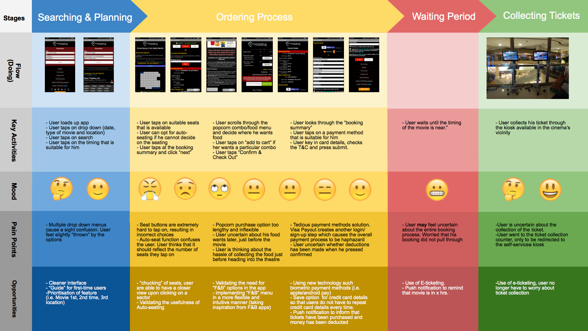
IV: Customer Journey Map
With both quantitative and qualitative results from our usability tests, we consolidated the findings into a customer journey map, to help us make sense of where the friction points are.
Insights
The results of usability test shows that the app is successful in serving its main purpose – to allow users to purchase movie tickets remotely. Nonetheless, participants experienced many pain points during the booking process and hence, proving that there is a need for improvement in terms of its design.
Some of the biggest friction points of the existing design were:
- Frustrating seat selection page – unwanted auto-seat function and challenging to select seats
- A tedious payment process and not assuring for paying customers
- Unappealing overall form and function of the interface
Ideate
Since the existing app was essentially a mobile version of the website at the time, we wanted to give it a revamp in order to utilise interactions that mobile apps can perform better. The new design should also address the top 3 friction points identified in our research phase.
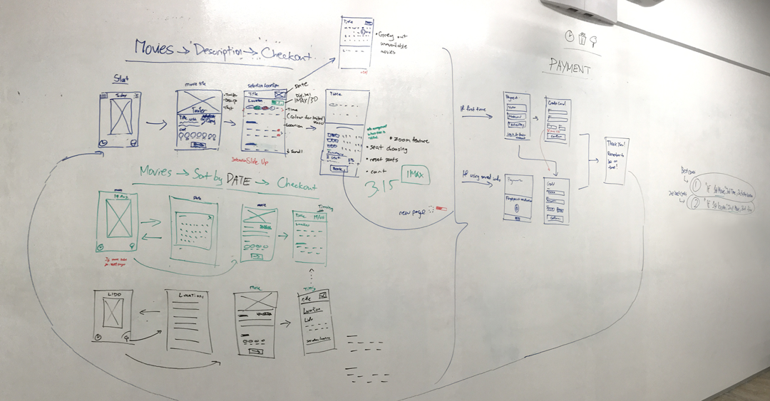
We spent a day sketching wire-flows that would make sense moving from point A–Z and tried to cover as many gaps as possible. Once we agreed on the initial low-fi sketches of all the required screens, I put together a clickable prototype quickly.
We tested our prototypes against the existing app for a benchmark on the effectiveness of our design, and to look for points of optimisations on our new solution. On the second round of iteration, we addressed identified issues and added micro-interactions on our prototype, to provide a smoother experience.
Prototype
Here's what we did to solve the 3 biggest friction points identified above:
1. Frustrating seat selection page – unwanted auto-seat function and challenging to select seats
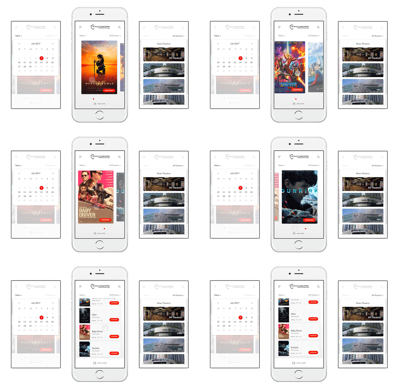
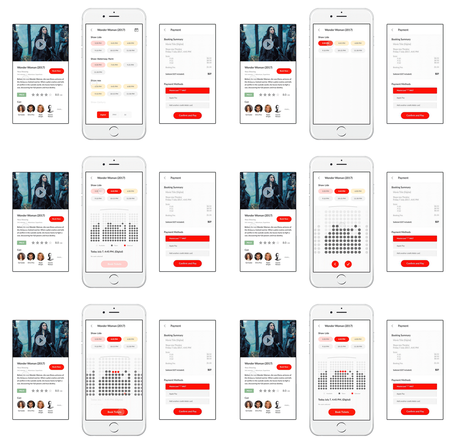
Made it convenient for users to see at a glance which seats are available, and to compare between different showtimes. Colour labels are also used on showtimes to give an idea of availability. A tap-to-zoom feature on the seat selection screen was added for a better mobile experience. These features were achieved with the use of micro-interactions.
2. A tedious payment process and not assuring for paying customers
Updated payment screen for a more contemporary flow and layout. Added the feature for users to save credit card details and opt for quick checkouts in the future.
3. Unappealing overall form and function of the interface
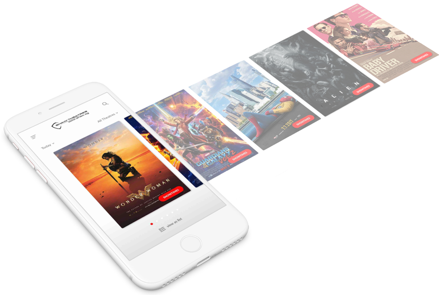
Revamped app for a more visual approach showing appealing movie posters upfront, with mutiple search functions available to users. Movie trailers and ratings are also easily accessible on the movie detail page.
Outcome
We tested our prototypes against the existing app to understand the effectiveness of our design. The results showed that the implemented features significantly improved on all the 3 key metrics. As seen below, we found that the overall efficiency of task completion rate has more than doubled, which is a good indicator of the redesign being useful for users.
